Tag Archives: art marketing

How to sell through art consultants and why you should

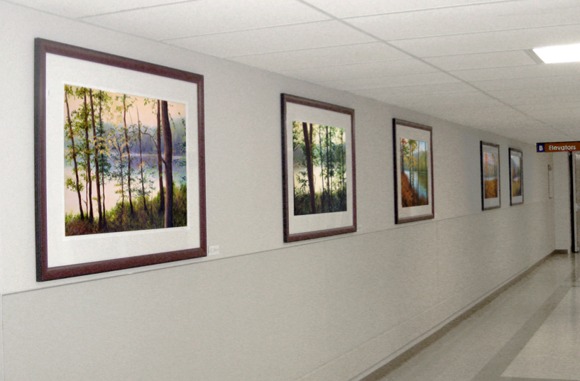
Liron Sissman art in Medical Centers
Artworks by Liron Sissman purchased by St. Joseph Mercy Oakland in Pontiac, MI

Many artists are so focused on obtaining gallery representation that they often overlook other potentially more profitable, and dare I say, easier to work with channels. They probably have good reasons. While galleries exists on many street corners, are visible, some even advertise, and one can just walk into them, few artists know how to find art consultants, let alone how to effectively work with them.

Unlike galleries art consultants are not ‘open to the public’. They don’t display art. And they don’t advertise to the general public. So why should you want to work with them? Well, they offer several distinct advantages. I will start by saying it is because they don’t display art to the public. What does that really mean to you as an artist? It means they don’t work on consignment. When you work with art consultants, you don’t need to spend your hard earned money to frame your art and then ship it somewhere just to see if someone may or may not eventually buy it. Speaking from experience, over the years there were paintings I could have sold if only they were in my studio when certain collectors came over. But the art was off premise, often at a gallery, and the sale that could have happened didn’t. The gallery that held the painting didn’t necessarily sell it on my behalf. Sometimes, months later, the painting came back. This is not meant as a criticism of the gallery system. Galleries typically sell to individuals and individuals generally need to stand in front of an artwork to fall in love with it and hopefully buy it.

Unlike galleries, art consultants typically sell art to organizations: Hotels, medical centers, and companies. Organizations are far more likely than individuals to buy art based on images. This means that artists ship art only after it has sold. For you as an artist, it means you can work with many more art consultants at a time than you could with galleries. It also means you can far more easily work with art consultants long distance, and cross country, than with out of town galleries.

I should also mention that art consultants deal with both originals and giclees. This too is an advantage as it allows you to sell your art over and over again.

Another huge advantage art consultants offer is the likely purchase of multiple artworks at a time. When a new building/center is built the art consultant in charge of the project is often looking to place hundreds of artworks at a time. I am currently speaking with an art consultant looking to buy 1,600 artworks. It is not unusual to sell many artworks at a time. In fact what is unusual is to sell but one.

Unlike shipping art to galleries and source worrying about the inevitable frame damage that occurs over time, shipping art to art consultants is relatively worry-free. This is because art consultants take care of framing on their end. Not only does this save money but it also simplifies shipping.

Art consultants offer a lucrative niche market and a great sales channel. They can easily supplement your other sales channels and they are easy to work with provided you know how to find them and reach out to them. They are NOT easy to find. They spend their time chasing the big projects rather than looking for artists. And, many who call themselves ‘art consultants’ do different things all together.

To save valuable time and effort locating and qualifying art consultants and to quickly learn all you need to know in order to successfully sell your art through them download my eBook: Getting Your Art into Corporate Collections: Why it pays, How to do it, Who to contact In it I share my Rolodex and guide you through the process so that you too know how to:

  •  Sell your art with no consignment
  •  Sell your art nationally
  •  Sell your art in multiples

Download your copy today and expand your sales into these lucrative markets!

Want to learn more about better selling your art? Sign up for my free newsletter by clicking below!

Please share your comments!


You may also like

Take time to recognize your achievements

Take note of your art achievements

Here is a bit of often under-appreciated advice I share with students in my workshop. I suggest they keep a log of their art achievements. It may be a simple Word document, with bullet points, under a date header that they occasionally revisit and update. In it they may wish to capture anything from tackling a new subject matter to landing a commission to being sought out for an interview in a magazine. Other milestones may include getting into a show you wanted to get into or doing your first (second, etc.) open studio. It can even be launching, or otherwise improving, your website. And, of course, recent sales.

Why do I do it? Because I know, from experience, that this log is an eye opener. It helps shine a light on the good stuff that happens when we are otherwise busy pursuing our art. Let’s face it, certain things we do don’t work out. There are rejections, unreturned phone calls, unanswered emails, frame damage, etc. These all come with the territory and breaking new grounds. It is sometimes easy for artists putting their blood, tears, and sweat into their work to over emphasize that which didn’t happen and to fail to recognize all that did, and does, happen. And, if you do this exercise, not only will it likely help change your perspective but you will likely also realize that many incredible things happened that you didn’t even plan for. In fact, you may even realize that some wonderful things that happened were things you could not have made happen if you tried.

Let me give you an example to illustrate my point. One afternoon, out of the blue, I got a call from HGTV wanting to include my art in an upcoming episode of their show, which is nationally syndicated. They even offered to renovate my home as part of the program. How did they find me? Well, it turned out they saw a press release I sent when a local hospital bought a number of my works. The press release included images of my paintings. Luckily my press release was not just run locally in print but was also included on the newspaper’s website. This online inclusion allowed a West Coast based show looking to feature a home art reception on the East Coast find ME. This is but one of many examples.

Keeping a log of your art achievements is a great way to keep things in perspective, recognize milestones, and spot some incredible patterns!

Do you take time to recognize your art achievements? Please share. I’d love to hear from you!

If you’d like to use my articles in your newsletter or on your blog. All you have to do is include the following:

Liron Sissman is a professional artist and an MBA. She coaches artists at ArtistAdvisory.com. This article was originally published in her ArtistAdvisory Blog: The Art of profiting from your Art which is sent to thousands of artists who are elevating their businesses. Start your free subscription today and read more articles like this at www.artistadvisory.com

You may also like

(T̶e̶n̶) Thirteen biggest website mistakes artists make – Part V

social_media_share_buttonsAllow me to continue this blog series by describing yet another common artist website mistake many artists make. If you are new to this blog topic please see Part I, Part II, Part III, and Part IV where I discussed the first eight common website mistakes I see many artists make.

I’ll continue where I had left off with the next common website mistake:

9) No social media share buttons

Social media buttons broadly fall into two categories. The first category is the ‘Hey come check out my Facebook page’ one. This type actually takes visitors off your website and brings them to your Facebook page which is not nearly as valuable as the second type; which is what I call the ‘Share’ type. The ‘Share’ type buttons are those social media buttons helping your site’s visitors share your site with their network be it on Facebook, LinkedIn, Pinterest, or Twitter. Done right it helps visitors share a link to your website along with a description of your artwork and possibly an image or two simply by clicking a button. And, it does all that while leaving visitors on your website! You can pre-define what gets shared when setting your social media buttons. It’s a great way to help spread the word!

Looking to gain more insights into how to become a successful artist? Learn what you need to know and be guided through the process, step by step. This is what my Art of profiting from your Art workshop is all about. And the best part is it’s now available online for you to study at your convenience. Click to learn the secrets only successful artists know and see your income grow! This workshop will more than pay for itself in no time!

Have you implemented any website changes that resulted in higher subscriptions and/or increased sales? I would love to hear from you what they were and what were the outcomes!

Copyright 2014, Liron Sissman, ArtistAdvisory.com. All rights reserved.

Would you like to share this article on your blog or newsletter?

If so, all you need to do is include the following with it:

Liron Sissman is a professional artist and an MBA. She coaches artists at ArtistAdvisory.com. This article was originally published in her ArtistAdvisory Blog: The Art of profiting from your Art, which is sent to thousands of artists who are elevating their businesses. Start your subscription today and read more articles like this at http://artistadvisory.com

You may also like

(T̶e̶n̶) Thirteen biggest website mistakes artists make – Part IV

So far in this blog series (Part I, II, and III) I have addressed six common website mistakes I see many artists make. Are you one of them? I’ll continue in this post where I left off.

7) Not using your website email

Most artists that email me are using an email provider such as: gmail, yahoo, hotmail, mac, and optonline rather than their own website domain email. As a result their email address typically varies from something as cryptic as: xw3evei69@gmail.com to at best something like: jmartist@gmail.com. While the latter is better than the former neither is as good as it ought to be. If you have a website you should be using your own website email for your art correspondence. That would be something like: Joe@JoeArt.com, or in my case: Liron@Liron.com. Using your own domain email will put your website in front of everyone you email with. Why advertise gmail when you can advertise your own art? Using your own domain email will also help in other ways. I talk about it in my workshop: The Art of profiting from your Art which is downloadable here.

If you are already paying for your website hosting, chances are you are already paying for your own domain email as well. Some template websites do not include it. However, there is still an easy way to set it up.

Use YOUR brand! Let people know what you are about!

8) No email address

Some artists’ Contact pages do not include an email address, just a Contact form. Are you one of them?

If so, I realize you may be worried about getting spam emails but there are other, better, ways to fight spam. While a contact form gives visitors a way to reach out to you, some people expect and prefer to use email. Unlike contact forms, an email retains a copy of the correspondence in the outgoing box of the sender thus making it easier to follow up on, or refer to, later.

Also, an email is more likely to offer a larger screen area to craft, review, and edit one’s message. I sometimes open a Word document just to conveniently write and edit my message before I copy and paste it into someone’s contact form. Why make people take extra steps to reach you?

Additionally, having your email, like having your phone number, clearly listed on your website will help visitors, and prospective clients, feel they know how to find you if they need to. It will let them contact you without the need to pull up your website and fill out forms.

Lastly, a contact form runs the risk of the person filling it misspelling their email address which could prevent further communication.

If your website offers a contact form, consider adding your email to it as well.

Have you recently made any website, or email, modifications that you found helpful? Please share your experience!

If you find my blog helpful, please share it! And, subscribe for future updates!

Copyright 2014, Liron Sissman, ArtistAdvisory.com. All rights reserved.

Would you like to share this post on your blog or newsletter?
If so, all you need to do is include the following with it:
Liron Sissman is a professional artist and an MBA. She coaches artists at ArtistAdvisory.com. This post was originally published on her ArtistAdvisory Blog: The Art of profiting from your Art, which is sent to thousands of artists who are elevating their businesses. Start your subscription today and read more posts like this at www.artistadvisory.com

You may also like

(T̶e̶n̶) Thirteen biggest website mistakes artists make – Part III

liron_sign_in_popup
From my website: Liron.com – Please sign in for future updates!

Let me continue this blog series by pointing out an additional common website mistake many artists make. Are you one of them?

While I’m addressing common artists website mistakes in no particular order I suggest you read this blog series starting with ‘Part I’ and ‘Part II’. These two earlier posts cover five common website mistakes many artists make. I’ll continue where I had left off.

6) No signup form

I coach many artists seeking to take their art business to the next level. But often times, when I first look at their website, I realize an important element is missing. I’m speaking here about an easy, convenient, way to convert visitors into subscribers. It’s called a ‘Signup form’.

People are not likely to email you out of the blue just to ask you to add them to your mailing list, keep them posted of your new artworks, or inform them about your future art events. However, if you facilitate the process and make it easy for them to keep in touch and stay informed, they would like that.

They came to your website either to see your art, or if your keywords are set up to attract your target market, one of the topics I cover in my Art of profiting from your Art workshop to find art like yours. Either way, they have separated themselves from the crowd. Help them connect and stay informed. Give them an easy way to share their name and email address with you. Then nourish the connection.

Your website is not just your business card. It’s also your active 24/7 guestbook (and store front – but that’s for another post and for those downloading my workshop which is now available online for your convenience!). Make your website work for you!

You can easily create and add a signup form using an email service such as Mailchimp, ConstantContact, or iContact. While at it, you may wish to consider making it what’s called a ‘popup signup form’; namely a form that actively solicits visitors to leave their contact information by opening a separate popup window asking them to do so. You can then specify what you will offer them in return.

Have you recently added a signup form that helped make a difference in your subscriber rate? Please share your experience.

Copyright 2014, Liron Sissman, ArtistAdvisory.com. All rights reserved.

Would you like to share this post on your blog or newsletter? If so, all you need to do is include the following with it: Liron Sissman is a professional artist and an MBA. She coaches artists at ArtistAdvisory.com. This post was originally published on her ArtistAdvisory Blog: The Art of profiting from your Art, which is sent to thousands of artists who are elevating their businesses. Start your subscription today and read more posts like this at www.artistadvisory.com

You may also like

(T̶e̶n̶) Thirteen biggest website mistakes artists make:

checkmateAs I started considering this topic for my next blog post, I quickly realized there were more than just ten. In fact, on first count, I came up with thirteen. I will not address them all today. I will start with the first three going down the list in no particular order:

1) Having just one image on your Home page

While having an image is better than having no image, you don’t want to put all your eggs in one basket so to say. Different people may naturally gravitate toward different images, perhaps even different subject matters all together. In fact, you may have several bodies of work and wish to represent them all. Why cut yourself short when you can easily hedge your bets? The solution: Offer instead a slide show of images on your home page. It will occupy just as much space yet give you a bigger bang for your precious e-real-estate buck. So to say, that is.

Now, there is also a strategic side that goes into choosing that special image, or subset of images, you use in order to represent your art. If you must only select couple of images, or couple of images of each body of work, or just one image for your business card, how do you make the best choice? Do you just pick your personal favorite/s? Do you select the last one you sold? Do you choose randomly and rotate your selection? Or do you have a good system in place that allows you to pick that one, or few, images well? If you don’t have a system to guide you, you are practically shooting in the dark. But you are not alone. Most other artists do too. This is why in my workshop: The Art of profiting from your Art, I teach artists how to systematically choose the best image/s to represent their art. Better make strategic decisions wisely!

On a technical note, If you are using a website template which limits you to but one image, I suggest you reconsider your template, and possibly your service. Many template-based websites, including free ones, allow the use of a slide show on your Home page. I teach a workshop showing artists how to create their free websites using free templates and free hosting by Google. Thousands of free templates to choose from, and… no lack of slide show ability.

2) Having no text on your Home page

While an image is worth a thousand words, text is also important. Its what search engines use to index your website. Its how you help your target market find YOU. Have at least one paragraph on your Home page that describes what your art brings to the table. If you have identified your target audience, use that precious space to explain how your art helps serve that market. Haven’t defined your target market yet? That’s okay too. Make your best effort to describe what’s unique and special about your art. And, when you do, be cognizant of the search terms most commonly used by people looking for art just like yours so that you can include them in your descriptions. Not sure how to find that? Its one of the topics I cover in my Art of profiting from your Art workshop.

3) Having no picture of YOU on your website

I know some artists are camera shy. But whatever concerns you may have there is probably some creative way to overcome them. I’m not saying your picture should be on your Home page as the first thing visitors to your website see. But I highly recommend having your picture at least on your Biography page. It helps personalize your art. It helps people better relate to instagram viewer private you as a person and, by association, better relate to your art.

Has your website avoided these traps? Or does this give you some ideas for improvement? Please share your experience!

Copyright 2014, Liron Sissman, ArtistAdvisory.com. All rights reserved.

Would you like to share this post on your blog or newsletter? If so, all you need to do is include the following with it: Liron Sissman is a professional artist and an MBA. She coaches artists at ArtistAdvisory.com. This post was originally published on her ArtistAdvisory Blog: The Art of profiting from your Art, which is sent to thousands of artists who are elevating their businesses. Start your subscription today and read more posts like this at www.artistadvisory.com

You may also like