Tag Archives: website improvment

(T̶e̶n̶) Thirteen biggest website mistakes artists make – Part VI

shopping_cartWhile on the topic of common website mistakes many artists make let me add this big one:

10) No shopping cart

Does your site offer a shopping cart? If so, you are ahead of the curve. Your site undoubtedly takes time to maintain and keep up-to-date. You spend your valuable time, and/or hard earned money, maintaining your web presence. Why not have your site work for you by helping generate some sales in the process? Many WordPress sites come with easy to install shopping carts. But shopping carts can be pretty easily added to any website. In fact, when I teach my workshop: Create Your FREE Website in a Day (scroll down on linked page), I show participants how to create a site that includes a FREE shopping cart.

For reasons too many to list and explain in this blog post, I don’t necessarily recommend artists price, or generally attempt to sell, their originals off their website. However, I do encourage artists to sell lesser priced items, such as giclees, off their sites.

If you are not sure how to do it, you may wish to seek help. My upcoming workshop would be a good place to start.

For your reference, as an example, my own art shopping cart offers giclees in various sizes of many of my oil paintings. It is viewable at: www.Liron.com/signed_editions.php

It’s an easy to maintain online shopping cart. As new artworks become available they are easily added in multiple sizes and on various substrates. The cart incurs no fees to maintain. It is integrated with my Paypal account and allows buyers to securely pay online using any major credit card, and/or using their Paypal balance. I only pay Paypal’s transaction fees when artworks sell.

Looking for a success strategy for your art business? From website improvements to attracting your ideal clients? I provide step by step instructions on art business strategy, marketing, and selling in my downloadable workshop: The Art of profiting from your Art.

Ready to share your experience with your online shopping cart? If so, I’d love to hear from you in the comments section.

By the way, if you just come across this post, I suggest you read my previous posts on the biggest website mistakes many artists make. See: Part I, Part II, Part III, Part IV, and Part V.

Liron Sissman is a professional artist and an MBA. She coaches artists at ArtistAdvisory.com. This article was originally published in her ArtistAdvisory Blog: The Art of profiting from your Art, which is sent to thousands of artists who are elevating their businesses. Start your free subscription today and read more articles like this at www.artistadvisory.com

You may also like

(T̶e̶n̶) Thirteen biggest website mistakes artists make – Part III

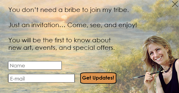
liron_sign_in_popup
From my website: Liron.com – Please sign in for future updates!

Let me continue this blog series by pointing out an additional common website mistake many artists make. Are you one of them?

While I’m addressing common artists website mistakes in no particular order I suggest you read this blog series starting with ‘Part I’ and ‘Part II’. These two earlier posts cover five common website mistakes many artists make. I’ll continue where I had left off.

6) No signup form

I coach many artists seeking to take their art business to the next level. But often times, when I first look at their website, I realize an important element is missing. I’m speaking here about an easy, convenient, way to convert visitors into subscribers. It’s called a ‘Signup form’.

People are not likely to email you out of the blue just to ask you to add them to your mailing list, keep them posted of your new artworks, or inform them about your future art events. However, if you facilitate the process and make it easy for them to keep in touch and stay informed, they would like that.

They came to your website either to see your art, or if your keywords are set up to attract your target market, one of the topics I cover in my Art of profiting from your Art workshop to find art like yours. Either way, they have separated themselves from the crowd. Help them connect and stay informed. Give them an easy way to share their name and email address with you. Then nourish the connection.

Your website is not just your business card. It’s also your active 24/7 guestbook (and store front – but that’s for another post and for those downloading my workshop which is now available online for your convenience!). Make your website work for you!

You can easily create and add a signup form using an email service such as Mailchimp, ConstantContact, or iContact. While at it, you may wish to consider making it what’s called a ‘popup signup form’; namely a form that actively solicits visitors to leave their contact information by opening a separate popup window asking them to do so. You can then specify what you will offer them in return.

Have you recently added a signup form that helped make a difference in your subscriber rate? Please share your experience.

Copyright 2014, Liron Sissman, ArtistAdvisory.com. All rights reserved.

Would you like to share this post on your blog or newsletter? If so, all you need to do is include the following with it: Liron Sissman is a professional artist and an MBA. She coaches artists at ArtistAdvisory.com. This post was originally published on her ArtistAdvisory Blog: The Art of profiting from your Art, which is sent to thousands of artists who are elevating their businesses. Start your subscription today and read more posts like this at www.artistadvisory.com

You may also like

(T̶e̶n̶) Thirteen biggest website mistakes artists make:

checkmateAs I started considering this topic for my next blog post, I quickly realized there were more than just ten. In fact, on first count, I came up with thirteen. I will not address them all today. I will start with the first three going down the list in no particular order:

1) Having just one image on your Home page

While having an image is better than having no image, you don’t want to put all your eggs in one basket so to say. Different people may naturally gravitate toward different images, perhaps even different subject matters all together. In fact, you may have several bodies of work and wish to represent them all. Why cut yourself short when you can easily hedge your bets? The solution: Offer instead a slide show of images on your home page. It will occupy just as much space yet give you a bigger bang for your precious e-real-estate buck. So to say, that is.

Now, there is also a strategic side that goes into choosing that special image, or subset of images, you use in order to represent your art. If you must only select couple of images, or couple of images of each body of work, or just one image for your business card, how do you make the best choice? Do you just pick your personal favorite/s? Do you select the last one you sold? Do you choose randomly and rotate your selection? Or do you have a good system in place that allows you to pick that one, or few, images well? If you don’t have a system to guide you, you are practically shooting in the dark. But you are not alone. Most other artists do too. This is why in my workshop: The Art of profiting from your Art, I teach artists how to systematically choose the best image/s to represent their art. Better make strategic decisions wisely!

On a technical note, If you are using a website template which limits you to but one image, I suggest you reconsider your template, and possibly your service. Many template-based websites, including free ones, allow the use of a slide show on your Home page. I teach a workshop showing artists how to create their free websites using free templates and free hosting by Google. Thousands of free templates to choose from, and… no lack of slide show ability.

2) Having no text on your Home page

While an image is worth a thousand words, text is also important. Its what search engines use to index your website. Its how you help your target market find YOU. Have at least one paragraph on your Home page that describes what your art brings to the table. If you have identified your target audience, use that precious space to explain how your art helps serve that market. Haven’t defined your target market yet? That’s okay too. Make your best effort to describe what’s unique and special about your art. And, when you do, be cognizant of the search terms most commonly used by people looking for art just like yours so that you can include them in your descriptions. Not sure how to find that? Its one of the topics I cover in my Art of profiting from your Art workshop.

3) Having no picture of YOU on your website

I know some artists are camera shy. But whatever concerns you may have there is probably some creative way to overcome them. I’m not saying your picture should be on your Home page as the first thing visitors to your website see. But I highly recommend having your picture at least on your Biography page. It helps personalize your art. It helps people better relate to instagram viewer private you as a person and, by association, better relate to your art.

Has your website avoided these traps? Or does this give you some ideas for improvement? Please share your experience!

Copyright 2014, Liron Sissman, ArtistAdvisory.com. All rights reserved.

Would you like to share this post on your blog or newsletter? If so, all you need to do is include the following with it: Liron Sissman is a professional artist and an MBA. She coaches artists at ArtistAdvisory.com. This post was originally published on her ArtistAdvisory Blog: The Art of profiting from your Art, which is sent to thousands of artists who are elevating their businesses. Start your subscription today and read more posts like this at www.artistadvisory.com
You may also like